LVL Wellbeing enhances mental and physical health with live and on-demand wellness content and personalized programs.
My role
User research, prototyping, UI design
Built and maintained a design system
Built and maintained the same design system in Arabic
Designed data visualizations to improve customer engagement
Results
Increased platform adoption rates through user-friendly design, resulting in a significant rise in sign-ups.
Boosted active user engagement through well-designed features and improved usability.
The bilingual atomic design system (English and Arabic), ensured consistency, scalability, and efficiency across all interfaces.
As the Lead Product Designer at LVL Wellbeing, I designed the entire mobile and web app from the ground up, ensuring a seamless user experience aligned with the platform's mission of promoting self-care.
Designing with Purpose
Collaborated closely with the CEO to design UI elements that not only aligned with LVL's vibrant and cheerful branding but also differentiated the platform's key pillars through distinct colors and patterns.
To create a cohesive and user-friendly interface, I balanced bold patterns and colors with light, subtle backgrounds, ensuring a harmonious and engaging design.
Scalable Design, Seamless Development
I created an atomic design system tailored to the fast-paced and ever-changing needs of a startup. This system introduced a modular structure, allowing us to make rapid adjustments, replace components effortlessly, and maintain a consistent visual language. Its intuitive design ensured scalability and efficiency, empowering the team to focus on innovation without sacrificing quality or cohesion.
Adapting Design for a Global Audience
An exciting challenge was developing a mirrored Arabic version of the design system to support right-to-left (RTL) layouts. Designing for RTL required careful adjustments to typography, spacing, and alignment to ensure a seamless user experience while staying true to the brand's cheerful and engaging identity. This bilingual system not only supported LVL’s global vision but also showcased the flexibility and adaptability of the design system.
Teams— Creating a Collaborative Space for Users to Share, Connect, and Promote Wellness Through Social Interaction
Teams was the next big feature at LVL, designed to drive user engagement and promote self-care through social interaction. The objective was to create a 'Slack-like' experience where users could join groups to upload, share, comment, and react to wellness content. This feature aimed to build a sense of community and encourage ongoing participation in wellness journeys.
As one of the most important features to work on, the challenge lay in integrating additional navigation without disrupting the existing interface. This was solved by designing a sleek pop-out navigation system specific to Teams, ensuring simplicity and ease of use. By incorporating diverse reaction options, we enhanced user interaction and made the experience more enjoyable, fostering a supportive and engaging wellness community.
Personalizing Wellness Profiles
To enhance user engagement on LVL's social page, I designed a series of customizable profile pictures for users who preferred not to upload their own.
These illustrations reflected the platform’s colorful and cheerful branding, incorporating elements that aligned with LVL's mission of promoting self-care and wellness. By offering visually appealing options, I ensured users could express their identity while staying connected to the platform's purpose, creating a cohesive and inviting social experience.
Daily check in widget— Promoting Daily Engagement and Self-Reflection
The objective was to design a visually appealing and intuitive mood check-in widget for the home screen, encouraging users to engage with the platform daily. This feature was developed in response to leadership's focus on enhancing user interaction. The design prioritized simplicity and accessibility, utilizing vibrant colors and intuitive icons to make mood selection effortless. The widget featured a clean layout with simple text and emojis, framed by a colorful border and a white interior to ensure the options stood out without overwhelming the user. This approach fostered consistent user engagement while aligning with LVL's cheerful and supportive branding.
Champion Metrics— Empowering Team Leaders with Actionable Wellness Insights
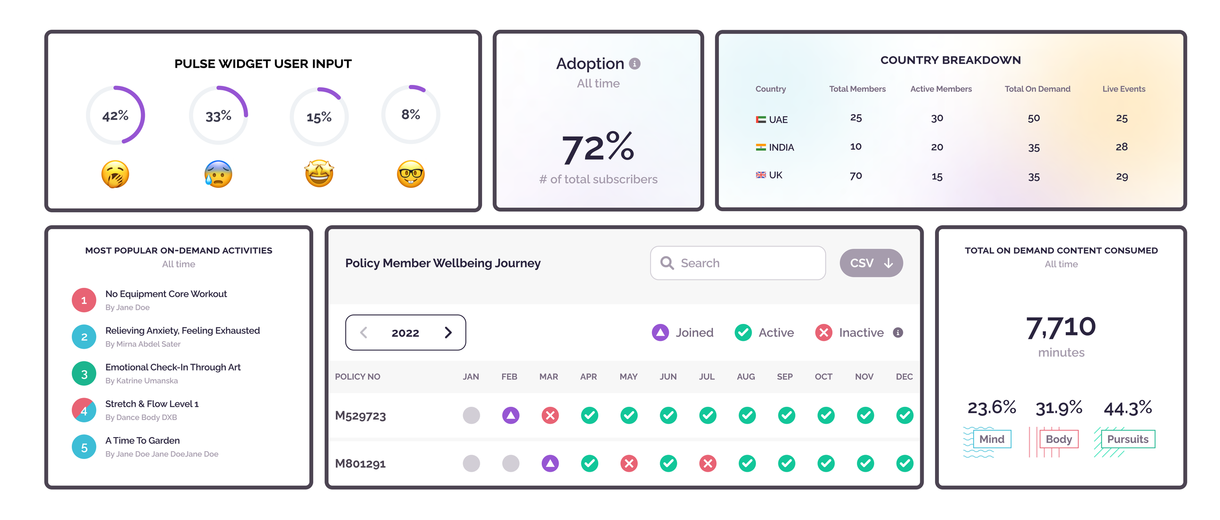
Collaborating closely with data analysts, I designed intuitive data visualizations for the Champion Metrics page, a tool that allows team leads and designated 'champions' (such as Cigna team leads) to track key wellness metrics within their groups. This page provided vital insights into activity rates, joining rates, and other metrics, enabling champions to monitor progress and ensure their teams are on track to achieve wellness goals. The visualizations were designed to be easy to interpret, providing champions with the actionable information they need to foster engagement and improve overall wellness within their teams.
Data Visualization for Enhanced Team Wellness Monitoring
As part of the Champion Portal, I collaborated with our Data Analyst to design a data visualization for the daily check-in widget. This feature provided champions with real-time insights into team engagement and participation, allowing them to track check-ins and identify patterns. By presenting this data in an accessible format, champions were empowered to improve team communication, identify areas where support was needed, and ensure timely wellness check-ins, driving enhanced team engagement and fostering a culture of continuous wellness.


