
Pick
Be as picky as you want
Pick is a grocery shopping mobile app that helps you pick food that is safe and suitable for you and your family to consume. It helps you avoid reading through all the ingredients on food labels by giving quick and precise answers to your questions.
Why should it exist? Who is it for?
The problem/target audience/the opportunity
Identification of ingredients in a food product is very tough especially when the consumer has a restricted diet or uncommon allergies that might not be specified on the product. 40% of the population in Vancouver under 35 years of age is either vegan or vegetarian. 100% of the users wanted to know more about the ingredients on food labels on the products. Aimed primarily at vegans and vegetarians in Vancouver aged 19-35. It is also for people who uncommon allergies and food restrictions.
Competitive analysis
Pinto is an app that helps users to follow their diet by helping the process of documenting their diet easier. It uses image recognition software to help ease the documentation process for the user but the software is complex and the scanner often does not work. Food scanner is very similar to the other food scanner app. Personalized list of things the user likes to eat or can’t eat, scanning of labels. It is not accurate, there are lot of issues with the scanner. It does not state the nutritional facts about the food. There is no search bar to find any ingredients that the user may find suspicious.
User interview questions
In order to understand the users in a better way, I conducted some user interviews.
Some of the questions were:
Do you have any uncommon food preferences or allergies?
What problems do you face when you go out to eat with your non-vegan friends?
What are the top problems when you go grocery shopping?
Do you read the ingredients every time you go grocery shopping? if yes, what bugs you about it?
User Research
Data points and online user interviews:
https://docs.google.com/spreadsheets/d/1tRopAcGMMXQWq0Bmpx3LPRco9ftFc0iU22Zlg0ushP0/edit?usp=sharing
Persona
According to the user research, I set up a persona for further generation of features of the app as well as the research to go forward.
User journey

Mental model

I statements from the interviews
I collected some of the “I” statements from the users to understand their concerns more. These statements played a huge role in coming up with
“I have to go to more than one shop to get everything I need.”
“I look really hard and think it’s okay to eat but end up getting sick anyway”
“I hate all the hidden and nonsense ingredients they add.”
“I will check ingredients if I'm considering processed food I don't know.”
First findings
Distance:
Users are not able to buy all the items from one place and have to travel to more than one place to get what they need.
Ingredients:
There are certain ingredients which do contain animal products in them but the labels are not sufficient to understand.
Other apps:
None of the users that I interviewed used any apps to make it easier for them to shop for grocery items
Feelings:
Many users felt lonely with their family and friends due to their dietary needs and restrictions. Some of them even said that they get made fun of.
Final MVP
The final product features were based on the findings.
A customizable profile
Efficient distinction of the ingredients
Multiple profiles in an account
Search bar for the ingredients
First Wire-frames
User testing results
The key changes that were made to the wireframes were:
A search bar and an “add more” option in the allergies so that the users could add more allergies if they wanted to.
A screen that indicates the number of profiles created after each profile creation.
I put the search bar on the scanning screen so that the user could search for the ingredient if not scanned, easily.
I performed user testing on the prototype of the initial wire-frames and the key takeaways were:
The users could not add more allergies that were not on the list
There was no confirmation window which said how many profiles were created after each profile creation
Navigating the search bar even though was not complicated, it was not something the users noticed
Final Lo-fi Wire-frames
User flow

Final Screens
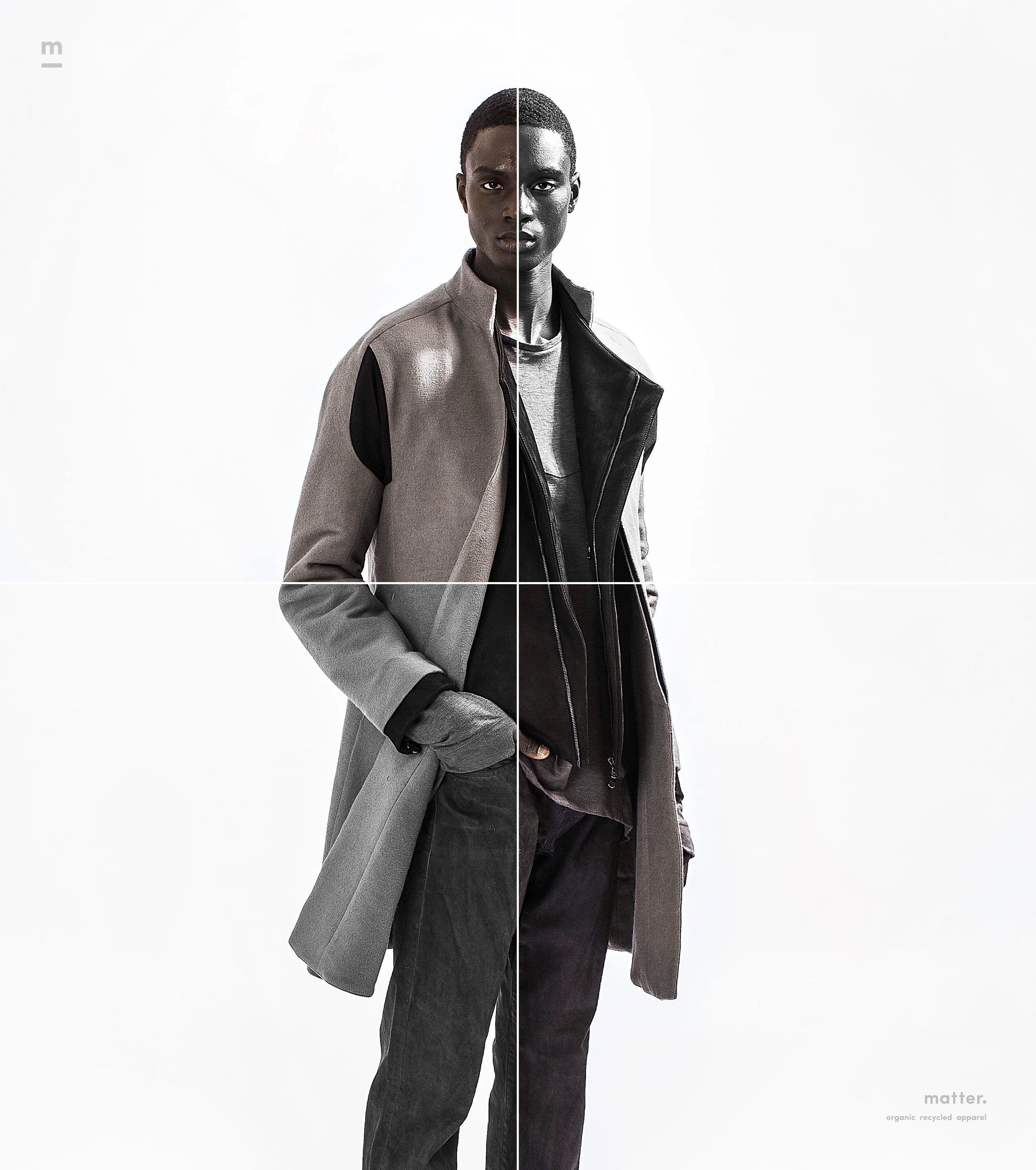
Branding
final logo


This is the image caption — use this space to describe the image above
Logo and branding treatment
Logo and branding treatment as icon
Minimal 24x36 poster design printed on hemp paper

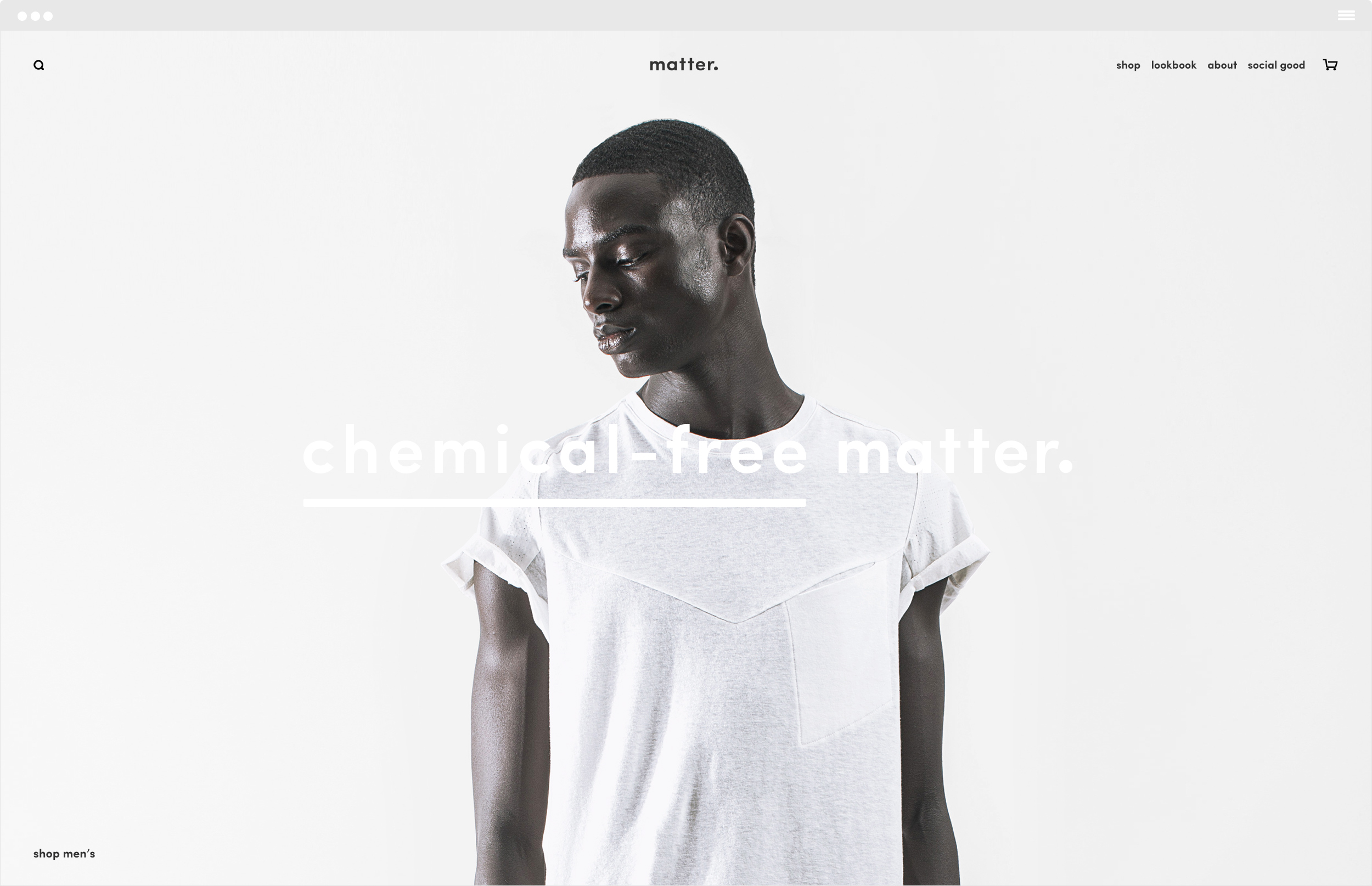
Home page design for their commerce web site


Product item page and UI design for their commerce web site

Features Overview
Feature 1
Donec eget risus diam. Nullam sit amet nisi condimentum erat iaculis auctor.
Feature 2
Vestibulum ante ipsum primis in faucibus orci luctus et ultrices posuere cubilia Curae. Nulla lectus ante, consequat et ex eget, feugiat tincidunt metus.
Feature 3
Donec ac fringilla turpis. Vivamus a ante congue, porta nunc nec, hendrerit turpis.
I solve problems through design
Welcome to the Henson template. To get started, watch these short videos on Squarespace basics and read the template guide. This area is perfect for generating visitor interest by going into more detail about yourself, your project, or your company.
This space is ideal for long form text. You can talk about how your idea started, how long you’ve been working on it and why it’s important. The more specific you are, the more visitors can engage with what you do. This is also an opportunity to answer any questions they may have about you or your work. Note that this paragraph and the one above were created with Text Blocks. Blocks are the foundation of your site. Learn more about them here.
Some selected accolades
Graphic Design & Illustration Annual 2016
Vector Gold Design Annual 2015
Typographic Heart
Vanguard Noteworthy Opinion Art 2014
Graphical Taxonomy
Communication Arts
FPO Magazine
CMYK
The Stylus on Paper
ConTextual
Beautiful Design Is
Twenty-Four Hours
Vivamus pellentesque vitae neque at vestibulum. Donec efficitur mollis dui vel pharetra.